
Android 12 turned out to be a major system update – in which Google implemented a new design direction called Material You. Earlier I wrote an article on why the new colorful interface with large elements is better than Material Design 2. Now it’s time to talk about the weaknesses. To some, these shortcomings will seem insignificant – this article reflects only a separate opinion based on experience.
The excess of colors and shapes looks frivolous
The updated design looks bright and unusual. Large elements are easy to press, rounds and cogwheel widgets have refreshed the appearance of the system. The number of colors has increased, large inscriptions have appeared, smooth animations with transfusions of light.
The system has become expressive and responsive, but this is also the disadvantage of Material You – it is less serious than the strict and laconic design of iOS or previous versions of Android. In pursuit of novelty, Google overdid it and added a whole zoo of curves and visuals.
Responsive icons
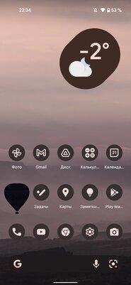
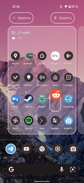
One of the new items in the customization section is Thematic Badges. It brings desktop icons to a uniform style with colors adapted to the wallpaper. Those who can distinguish between icons by color will hardly like this feature – it will be difficult to quickly find the one you want. But lovers of minimalism and unification will prefer to include “Thematic icons”. And immediately faced with a mess on the desktop. At the moment, only a small part of all applications are being adapted.
Even not all programs from Google support the function. Should I mention third-party developers? It will take years for popular apps to add support for responsive icons. Until then, desktops with Themed Icons enabled will look messy rather than stylish and minimalistic.
Gone is the customization
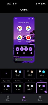
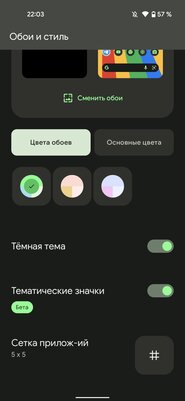
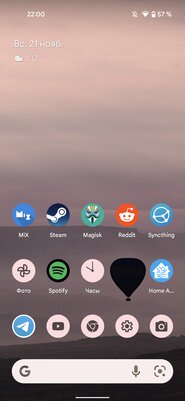
The main feature of Material You is system colors that adapt to the wallpaper palette on the desktop. But with its appearance, some of the appearance settings have disappeared. Now you cannot change the font built into the system, the shape of the icons on the home screen and the icons in the status bar. If earlier all this was in the “Wallpaper and style” section, now there is only the application grid setting, the accent color selection cut down in comparison with Android 11, and a couple of switches.
Loss of individuality
Programs that follow the general design principles look beautiful and harmonious. But when all of their elements are painted with the same color taken from the wallpaper, it misleads users. It becomes difficult to distinguish between applications that look the same.
Now this problem only affects proprietary utilities. Google should work on the variety of its mobile software designs. Developers of third-party programs are in no hurry to switch to Material You, so their loss of individuality has been bypassed. But here we can also note another problem – most applications will get out of the general style.
Unjustifiably enlarged elements
I have said more than once that large elements make it easier to press them with one hand or on the go. And it’s easier to get data from non-interactive objects. Unfortunately, this is not always the case. Some things in Android 12 are made big for no apparent reason.
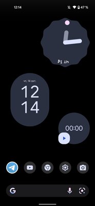
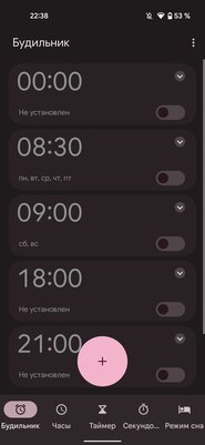
So, in the alarm clock application, the place at the bottom was taken for some reason by a giant add button. It covers the cards and does not hide in any way. No less strange look are barely accommodating Russified signatures in the bottom panel. Cherry on the cake – the inscription “Secundo …”. The feeling that I got into the Chinese shell, and not pure Android.
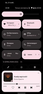
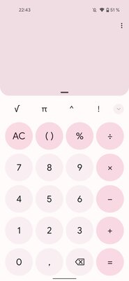
The tiles in the notification shade are another example of poor design. They have increased, but there is less useful information. At the same time, the same number of switches are placed in the expanded form, as before, but the signatures do not fit entirely and therefore scroll, and the block height has become larger, which makes fewer notifications fit. Quick access tiles made too huge unnecessarily.
At first glance, the way Material You is implemented in Android 12 evokes only positive emotions. A detailed examination of the system reveals flaws that do not allow calling the fresh design ideal.
This article is inspired by Android Police.
Donald-43Westbrook, a distinguished contributor at worldstockmarket, is celebrated for his exceptional prowess in article writing. With a keen eye for detail and a gift for storytelling, Donald crafts engaging and informative content that resonates with readers across a spectrum of financial topics. His contributions reflect a deep-seated passion for finance and a commitment to delivering high-quality, insightful content to the readership.


