
I’ve spent the last 10 years at the Apple Club, using the company’s products and enjoying the philosophy of good design that Jobs once articulated. iTunes was one of those products—I spent a significant amount of my time building my personal library and syncing content to my iPod. But one day I discovered Spotify, and soon my iTunes library began to collect digital dust.
After a flurry of rumors and insiders, Apple has finally entered the streaming race by ditching iTunes, replacing it with its Music app, with the added feature of streaming music and other content based on a paid Apple Music subscription. And after many years of using Spotify, I decided to give Apple a try, and then I used Apple Music for a whole year. Now I’m ready to express my thoughts, as a designer and an ordinary person who wants to listen to music in comfort, about what exactly is implemented incorrectly in Apple Music.
Search
One of the key features of the music app is search — it’s definitely one of the top three you use the most. So why is it OK for Apple to keep medieval search on the desktop? Let’s take a look at what I’m talking about…
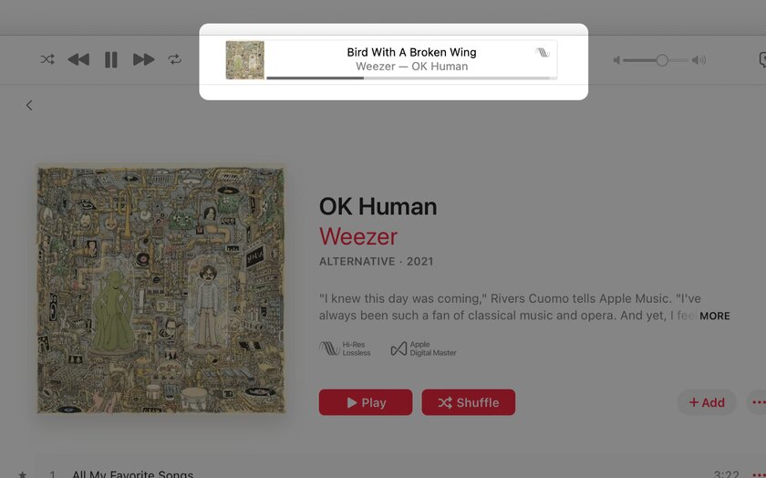
Let’s say I want to find a fairly well-known rock band. Let’s look for Weezer – they’re a cool band.
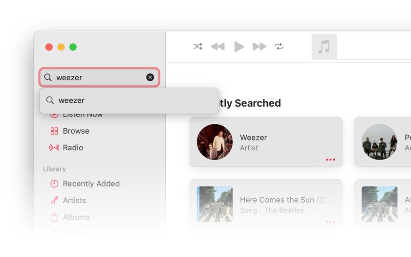
Great, we have successfully recruited Weezer. It even seems to have an automatic prompt. But wait — is this just an auto-suggestion?
Let’s try typing Wezer while pretending to misspelled the name of a well-known band, to double-check that it’s actually an auto-suggest to help confirm that the system matched the query with Weezer in the Apple library.

That’s right, I think it’s not self-hypnosis. But are there any auto-suggestions in the application at all? Let’s check. How about looking for a really popular rock band – Queen.
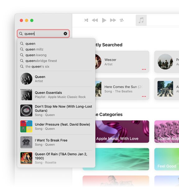
Why does Queen have a decent result in quick access, while Weezer doesn’t?
Well, let’s see where exactly our search leads. Let’s click on the drop-down menu and go where it takes us.
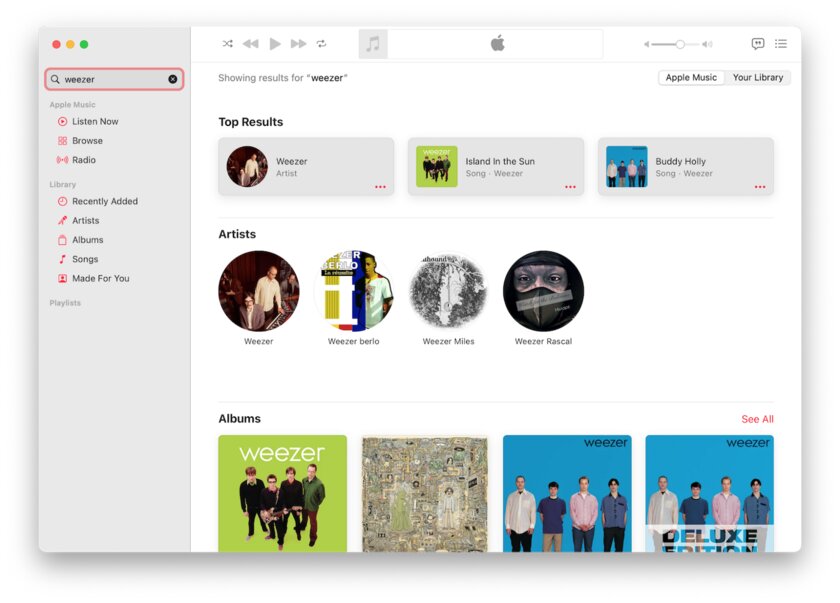
Apparently, we are now on a brand new search results page. Of course, it would be nice to be able to skip this page completely, for example, if we are looking for Queen, since all I really wanted to do was go straight to the music. But okay.
Let’s go back a page and think about what we would like to do next. But now I don’t remember where I was last time, but I know that I would like to go back there. So, how would I do this? Most likely, you need to click on the back button, like in a browser, right? No.
As it turned out, there is simply no back button. At least there is no universal back button that would cancel any user action that has been taken. Do you already know why?
Navigation
I don’t know about you, but I find Apple Music’s navigation mechanism to be one of the worst aspects of the app. The thing is, good apps don’t make you think about exactly where you are, you just know it. Good apps make it easy to undo an action and get back to where you were. Really good apps don’t make you think, “Oh great, I’m lost, how do I get back.”
It’s worth noting that Apple’s UI guide for iOS suggests three types of navigation for apps, and apparently Apple is using the same concept on macOS as well. Because, as it turns out, Apple Music uses “Flat Navigation”.
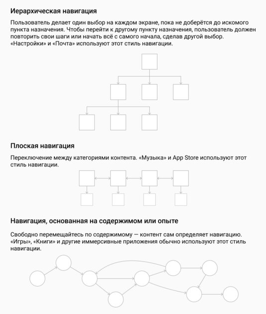
Cool – we have a sidebar, so this decision makes some sense, right? Actually, I don’t think it makes any sense. “Flat navigation” works great on mobile devices because the screen area is small and you use the navigation bar a lot. So the user can always tell which tab they’re on and can explore each tab much more deeply independently of the others.
This solution has been around since the launch of the iPhone for a very good reason – it does the job well and makes it harder for the user to get confused about exactly where he is. But how does it work on desktop?
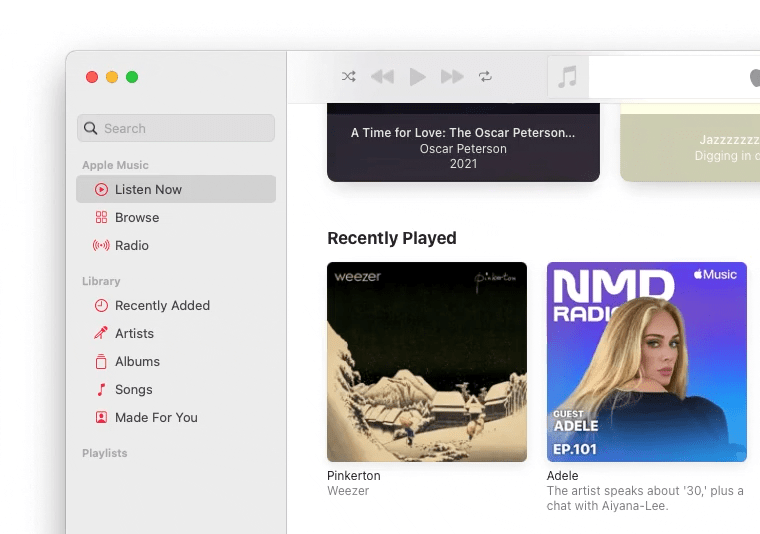
Using this type of navigation means that each item in the sidebar has its own independent navigation. For comparison, let’s take a look at how Spotify implemented desktop navigation.
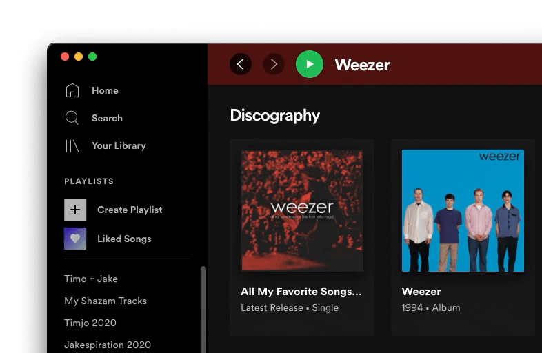
Noticed the difference? Spotify takes advantage of the always-on sidebar while still making it easy for you to follow your steps no matter where you click in the app. That is, the application includes a back button when you navigate through the menu.
Why, in my opinion, is this a much better approach than Apple’s?
This reduces cognitive load. People don’t have the time or energy to remember exactly where they went in the music app.
People are used to using the back button in their browser. And Spotify uses this habit to ensure that the app’s behavior matches the expectations of new users.
This reduces the level of anxiety and allows users to freely explore the application without fear of making a critical mistake that cannot be fixed later.
Feedback and content research
Clicking is the most important part of any application, because the user needs to click anyway to go somewhere. But with Apple Music, everything again works a little differently.
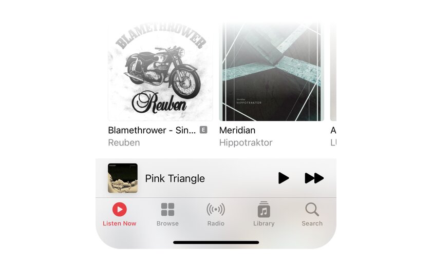
Let’s take a modest and unsuspecting playback panel.
Functionally, it hasn’t changed much since the launch of iTunes – it’s an easy way to see exactly which song is currently playing.
So you’re dancing to one of the new Weezer songs and you’re like, “Hmm, this band is really great, let me listen to the rest of their catalog!” Let’s hit Weezer right from here!

Hmm, wait, what happened? We click on the name and album – nothing happened.
Can you guess how to navigate to a directory using this play panel?
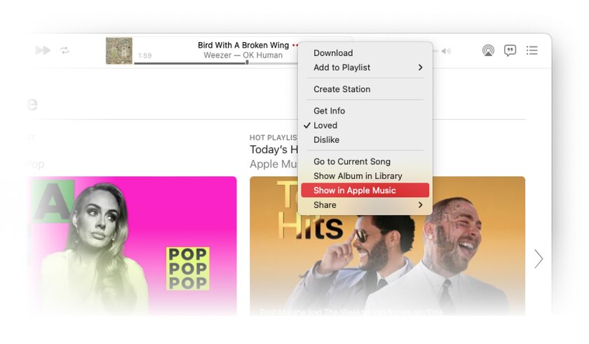
To do this, you need to open the “More” menu (three dots), look through the entire list of items in the menu and find the item “Show in Apple Music” almost at the very end.
What about other areas in the app – can you click on a song, album, or artist to get the features you need?
Turns out that doesn’t work either.
Now you are probably wondering why I devote so much time to this problem. I think the whole point of a music streaming platform app, especially one designed to discover new music from a huge streaming library, is to actively click, explore, and easily find songs, albums, or artists. I don’t think the user should be penalized because they don’t want to agree with how the app wants to be used.
And when it comes to Apple principles, consistency for the sake of consistency is not always the best solution.
Response time
A good app doesn’t keep the user waiting. We know that long load times have a direct impact on web bounce rates, and I don’t think it should be any different for native apps.
And that brings us to one of the biggest problems when using the Apple Music app:
Constant waiting when switching between pages. Frequent loss of scroll position. I don’t know if the song will play when I click on play. It’s not clear why the app can’t take me back to where I left off when I closed the app. And this list, unfortunately, can be continued for a very long time.
Summarizing
Is the Apple Music streaming service that bad? I believe that one should strive for good interface design. I want to love Apple Music. Especially since I think Apple has really strict design principles. But I can’t love this service. This product simply did not allow me to enjoy music to the extent it should. I have to struggle with the app to use it.
It’s a shame, because there are actually some great things about Apple Music as a music streaming service.
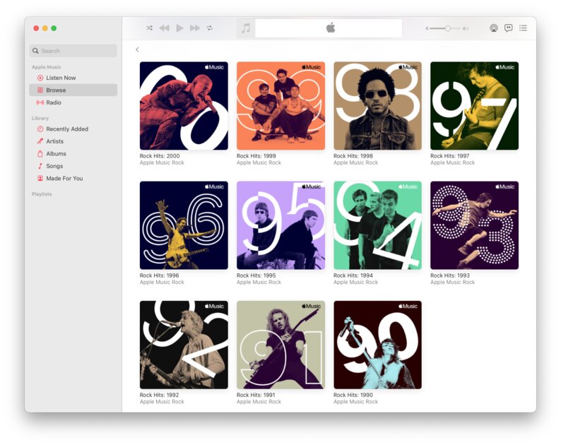
- In terms of content curation, I’ve found that Apple really selects high quality tracks. From songs picked by people (like the playlists shown above) to an algorithm that finds great music for me based on tracks I listen to often. In this regard, the service is very similar to what we are used to getting from Apple, I never ceased to be surprised by the quality of the recommendations.
- My wife and I first discovered the beauty of country music while listening to an Apple Live radio show.
- What’s more, in terms of audio quality, I actually prefer Apple Music over Spotify, the fact that the service offers lossless quality is also good news.
Positives like these make me even more disappointed because the product is very difficult to use.
In the end, the problem lies primarily in the fact that Apple is not very clear about what exactly its product is. If the Music app is the successor to iTunes, then the company unfortunately missed its mark because the developers tried to cram the Apple Music streaming service into an outdated app paradigm. And if Apple Music is to be in the spotlight, the developers didn’t let it shine one hundred percent as a standalone service.
One thing I can say for sure is that Apple Music for desktop developers need to do a lot of work to achieve a decent level of user experience.
What do you think?
This is a translation of the UX Design article. Illustration for the article – Jan Marin.
Source: Trash Box
Donald-43Westbrook, a distinguished contributor at worldstockmarket, is celebrated for his exceptional prowess in article writing. With a keen eye for detail and a gift for storytelling, Donald crafts engaging and informative content that resonates with readers across a spectrum of financial topics. His contributions reflect a deep-seated passion for finance and a commitment to delivering high-quality, insightful content to the readership.


