
It makes no sense to take into account the software that was available on mobile devices long before the birth of app stores – because of the extremely small screens, it was too primitive. But the programs that began to appear on portable gadgets after the birth of the App Store and Google Play have really changed the attitude towards a whole class of devices. The developers carefully adapted the interfaces of their services for relatively compact gadgets, and users adored them infinitely and enjoyed every new creation with great pleasure. However, until today, everything has changed very much. Mobile applications were put on the conveyor and turned into purely marketing tools. Most of them are complete nonsense, and here’s why.
Apps force notifications to be kept on
Send tons of ads between helpful posts
Recently, I noticed that almost every more or less large online store has mobile applications, as well as services that are associated with retail in any of its manifestations. Moreover, I was often surprised that many of them do not work fully in the mobile web version, persistently motivating to install a separate program. However, in the end, I came to the conclusion that it is in this form that it is easier for services to slip their advertising offers to the user and exploit other marketing mechanisms. Mobile applications prompt you to activate Push notifications, motivating it with the expectation of a personal message, information about the availability of a product, or something similar, but along with useful data, they show the user everything. Honestly enough.

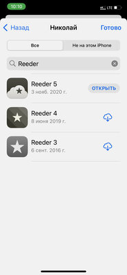
New versions of applications have to be purchased again
Initially, such software is positioned completely differently.
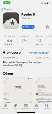
From the point of view of monetization, mobile software is usually divided into three equal groups. First, there are shareware apps that can be downloaded without payment, but their developers receive funds through ads or in-app purchases of additional content. Secondly, there are mobile applications that can be accessed by subscription – the first 7-10 days are usually available free of charge, but then you have to pay monthly or once a year. Thirdly, there are mobile applications on the sites, which are usually called premium – you need to pay for such only once, and you can use them for as long as you like. However, developers periodically classify their software in the latter category, but release fresh versions in the form of separate programs that have to be purchased separately. At the same time, support for old revisions is actually terminated. How so ?!
Subscription appears even in very primitive applications
These most often do not need support and updates.
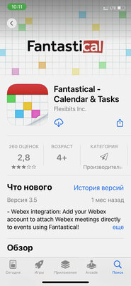
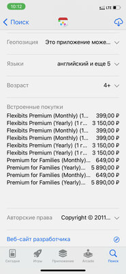
If we continue the story of app monetization, then I, again, absolutely incomprehensible the attempts of developers to implement a subscription in an absolutely inappropriate software for this. No, modern trends are more than clear to me. Today, in general, it is not customary to buy something for permanent use. This applies to housing, cars and many other things – including content. You pay for a regular subscription to a streaming service, but you use it entirely – no questions asked. However, sometimes we come across comical examples – conditional calendars and calculators, which do not require royalties and do not need regular support. However, developers still demand that their software be paid for over and over again. Does this approach seem impudence to me alone?
Apps try to take more time from the user
It seems that they are simply stealing seconds, cons and hours.
It’s no surprise that apps are designed to take as much time as possible from their user. This is especially true for retail and social services. The latter are especially indicative in this regard – what is only the search menu, which is combined with a random selection of popular content on one well-known site with stories and photos. I went to find a person or any business of a local spill, but disappeared for tens of minutes and even hours. For services that sell something, users’ personal accounts with a list of their own purchases are usually so far away that you have to punch the way to them almost through the entire range of the site. The reasons for such decisions are very clear, but they are still annoying.


Not all mobile apps are built according to system guides
They use their own logic and design principle
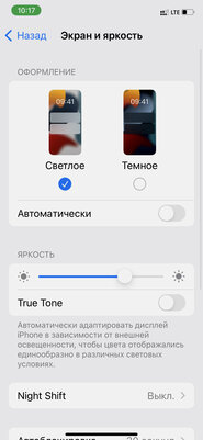
In the end, mobile applications that are built without using operating system guides are also frustrated. Usually this is necessary in order to realize maximum involvement, as well as to take advantage of many other mechanisms of influence on the user, among which, among other things, there may also be psychological ones. An interface that is designed according to its own rules is annoying for three reasons. Firstly, it has an unusual construction logic that you need to get used to. Secondly, it is very different from the rest of the software, which causes some dissonance. Thirdly, such applications do not respond to the general settings of the operating system – the current theme (day or night), font size, and so on. It’s hard to say who might really like it at all.

Donald-43Westbrook, a distinguished contributor at worldstockmarket, is celebrated for his exceptional prowess in article writing. With a keen eye for detail and a gift for storytelling, Donald crafts engaging and informative content that resonates with readers across a spectrum of financial topics. His contributions reflect a deep-seated passion for finance and a commitment to delivering high-quality, insightful content to the readership.


