
For almost a month, the Internet has been discussing the imminent release of a new smartphone from Coca-Cola, which promised to diversify the gray and dull design of modern mobile devices. And today, February 10, the official announcement of the device took place, which, as expected, is not produced by Coca-Cola, but by its partner company, Realme. The most famous soft drink brand is the creative inspiration behind the unique device – the manufacturer took Coca-Cola’s signature colors as a basis, as well as the logo and many other decorative elements. Ultimately, the smartphone really looks amazing, and no one wants to wear it in a case.

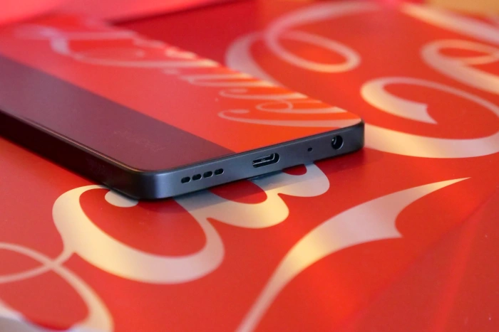
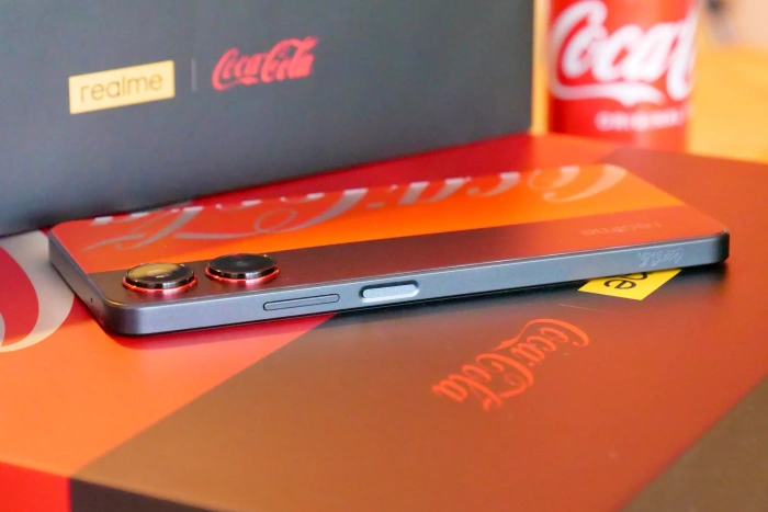

On the front panel, you won’t be able to notice any design frills, because due to the huge display and thin frames, there is simply no room for maneuvering. But on the back panel you can see an extremely unusual layout – the manufacturer divided the panel into two sections (70% and 30%), one of which was painted in black with a matte finish with a camera system, and the other in bright red with a glossy effect. On the same red section, there is a brand logo, made in silver, so that outwardly the gadget really looks at least attractive. However, I would like to immediately note that this panel is made of plastic and only looks like metal.
If you look “under the hood” of an unusual smartphone, it turns out that this is Realme 10 Pro, which was introduced at the end of 2022. The smartphone from Coca-Cola has exactly the same characteristics, which, however, was expected. We are talking about the entry-level Qualcomm Snapdragon 695 processor, a 6.67-inch AMOLED display, a 5000 mAh battery and a 108 MP main camera. This is a great mid-range gadget, which was simply complemented by an eye-catching case design. True, the manufacturer went a little further and made small changes even to the interface in order to complete the overall picture.
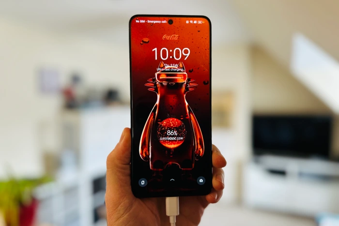
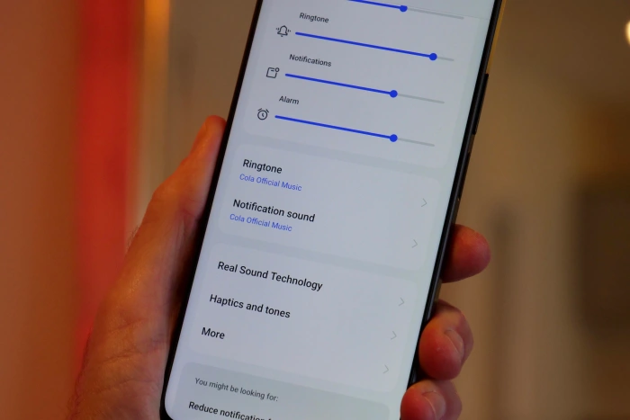
The fact is that the developers from Realme have redesigned the smartphone firmware interface from Coca-Cola, replacing the icons, color scheme and some additional elements. As a result, the interface design is fully consistent with the overall design of the Coca-Cola brand – even the desktop screensaver is matched (it’s a pity, however, that this is not an animated screensaver, but just a photograph). The developers even changed the fast charging animation, and the shutter sound reproduces the pops and hisses that can be heard when opening a bottle of black drink. Quite an interesting solution that will suit fans of the brand or collectors.
Source: Trash Box
I’m Meagan Diaz, a news writer and author at World Stock Market. My main focus is on technology and stock market trends, and I’m passionate about helping readers stay informed on the ever-changing landscape. I bring extensive knowledge of the industry to my work as well as a knack for storytelling that makes my articles both accessible and engaging.


