
Material You, which, along with Android 12, was introduced back in 2021, turned out to be a real breakthrough. Moreover, it is interesting not so much for its appearance as for its complex technical implementation. Google managed to invent its own color space, which takes into account the shades of the installed wallpaper and adjusts the colors of the interface elements to match them. Ryne Hager of Android Police, along with James O’Leary, one of the architects of Android, sorted out some interesting nuances in the work of Material You.
The main principle of Material You is the contrast of elements
Android architects have been working on the concept of dynamic colors for years – O’Leary emphasized a clear emphasis on this direction. It was developed with Matias Duarte, as well as other Google designers. There were enough diverse ideas for a long time, but the Material You concept was stopped precisely while working on the Pixel 6.
We felt that with the transition to the incredible new Tensor processor in the Pixel family, there was a really powerful leap. At this point, we wanted the software to fully match the hardware… Then we decided to go for broke and launch the project this year…
Of course, during the design of Material You, it was transformed many times. During the implementation of the project, engineers and designers faced a huge number of technical problems, as well as difficulties in executive planning. After all, it wasn’t just a layer of “paint” over the traditional Android interface. Material You is something much more complex.
One of the most important features of the new design was to be the contrast between user interface elements. It was planned that Material You would automatically select such shades of elements that professional designers would stop at. It was important that all of them were not only combined with each other, but also were clearly distinguishable.
By and large, choosing a few beautiful colors for the design of the interface based on the installed desktop wallpaper of the system is a fairly simple task that literally anyone can handle. It is much more difficult to ensure legibility of buttons and other elements, regardless of their combination. This problem has been solved.
Carl Sagan once said, “If you want to create an apple pie from scratch, you must first invent the universe.” It was this principle that Google was guided by when developing Material You. The operating system architects had to come up with their own color space with a simple choice of contrasting colors.
For Material You came up with a new color space
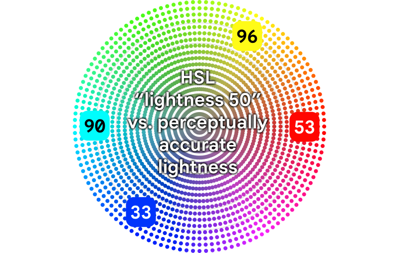
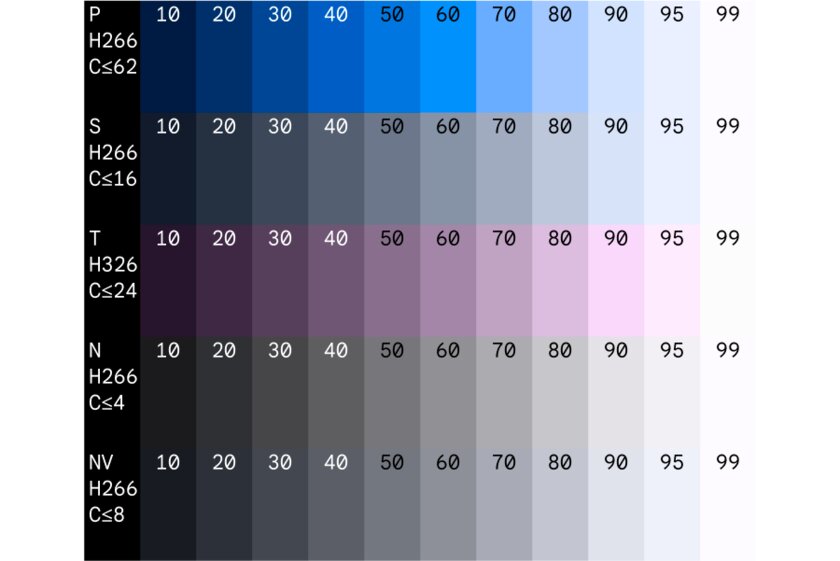
HSL is a color model developed in the 70s that uses “hue”, “saturation”, and “lightness” to define a particular hue (HSL is an acronym for Hue, Saturation, Lightness). Almost all designers choose it to work in the digital space. It turned out that it is not suitable for solving Material You issues.
The color model, which has been in operation for more than 50 years, is far from ideal. The example below compares hues with a lightness value of 50 using the HSL scheme. In practice, it seems that for some this indicator approaches 30, and for others it approaches 90. Those who work with color take this fact into account. But the algorithm will not be able to do this automatically.
To solve this problem, Google came up with a new color space based on the concept of tone. This helped engineers deal with the issue of contrast between interface elements during automatic color matching. According to O’Leary, this approach made it possible to worry only about how far the shades are in tone level.
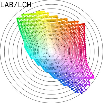
The tone reference was taken following the example of another more accurate color space model from the 70s – LAB. It could not be used to its full potential due to some inconsistent results from the automatic hue selection. Google also thought to focus on CAM16, but the accuracy of this model was also not enough. Therefore, in the end, they created their own – HCT.
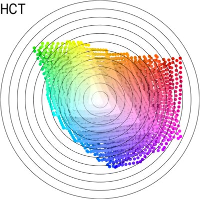
The issue of color spaces is controlled by generally accepted standards. However, they relate to HCT only indirectly. The layman will not have to worry if his new TV supports the new Google development. The model was created for purely internal purposes. It is needed to automate the choice of shades of the interface, and it does an excellent job of it. But not more.
When skeuomorphism was the norm, the issue of interface contrast was not so acute. Then each element was individually worked out on the basis of real objects from the surrounding world. Designers simulated a three-dimensional space with icons, items and tips located in it – they could not merge with each other. Minimalism has changed everything.
The industry got stuck when it switched to flat design in the 2010s. We had to choose a couple of colors, and everyone usually settled on a sharp white and some bright on top, depending on the platform or application … We had to give designers the opportunity to talk about contrast and lightness when choosing color pairs from a larger variety of shades.
However, the new color space was still not enough to solve all the problems. O’Leary notes that while working on Material You, another issue related to hue mapping came to the fore. There was no time left to find an answer to it, so we decided to use a fairly simple algorithm.
The first task of Material You is to choose the initial color
Material You does not use machine learning – it is a simpler algorithm that guarantees accurate results. The fact is confirmed by the fact that at the first stage the feature uses the principles of reducing the number of colors, following the example of GIF. From the gradients that smoothly transition into each other, key shades are selected that will fall into further circulation.

The original image is reduced to a palette of 256 colors. Then there is an assessment and a double comparison of all shades: based on the brilliance and scale of use on the canvas. Points that are too bright or close to gray are discarded. As a result, four optimal colors remain, from which a suitable initial shade will be selected.
Based on the base color, the main palette is developed, which will be used to design the interface elements of the operating system. Material You takes into account colors that go well with the original shade. The output is fixed values for the background, buttons, icons and everything else. All this fits perfectly.
The algorithm seems to be as simple as possible. Moreover, it seems that he does not leave the work to the designers. This opinion is erroneous, because it is such specialists who create the principle of forming the interface palette. O’Leary notes that the perfect contrast is a pair of black and white. But few people want to see only them in the Android interface.
There is an important place for design work. A developer can write any algorithms they want… But things are much more complicated. When interacting with engineers, it is up to the designers to come up with the formulas. Moreover, they themselves also do not have the opportunity to open Figma and, conditionally, choose the red that they just like.
Material You is suitable not only for the Android interface
The first acquaintance with the Material You system happened precisely through the Android interface. Many believed that Google would close its principles to the world, but the company acted differently. Both smartphone manufacturers and developers of third-party applications will be able to use automatic creation of a color palette. GitHub already has the necessary software for them.
It’s so cool to use a smartphone that doesn’t look like a static piece of modern art stuck on the same presentation… It’s great to use a gadget that remains elegant and deeply thought out, but pleases… Instead of stable boredom, there is a feeling of endless opportunities for experimentation.
Source: Android Police.
Source: Trash Box
Donald-43Westbrook, a distinguished contributor at worldstockmarket, is celebrated for his exceptional prowess in article writing. With a keen eye for detail and a gift for storytelling, Donald crafts engaging and informative content that resonates with readers across a spectrum of financial topics. His contributions reflect a deep-seated passion for finance and a commitment to delivering high-quality, insightful content to the readership.


