
Some attentive Internet users have noticed the updated Volvo logo on the company’s official pages on social networks Facebook, Instagram and Twitter. It looks like the Swedish carmaker is simplifying its logo in line with the current trends in graphic design, which are devoid of complex and voluminous elements.
The logo has not yet been officially presented, and the corresponding changes are still noticeable only on selected Volvo sites. However, a Jalopnik source with direct ties to Volvo confirmed that this is indeed the company’s new logo and will be in use from 2023.
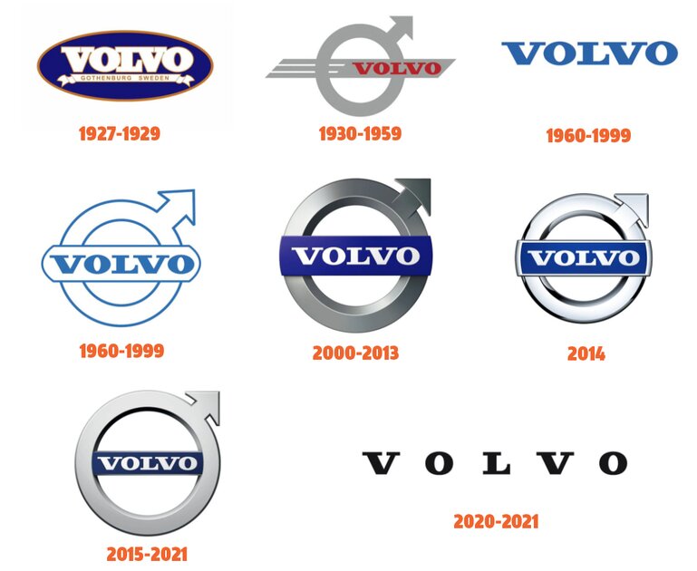
The updated logo is completely flat. It is still the circle with an arrow pointing to the upper right corner that was present on the very first Volvo car, the 1927 ÖV 4. It means the antique symbol of iron as well as the Roman symbol of the God Mars. The logo will appear in all divisions of the company, including cars, trucks, buses and even marine. Each of them will use specific colors to make them stand out from each other.
Recall that last year the logo was also updated by such automakers as Kia, Peugeot and Renault.
Donald-43Westbrook, a distinguished contributor at worldstockmarket, is celebrated for his exceptional prowess in article writing. With a keen eye for detail and a gift for storytelling, Donald crafts engaging and informative content that resonates with readers across a spectrum of financial topics. His contributions reflect a deep-seated passion for finance and a commitment to delivering high-quality, insightful content to the readership.


