
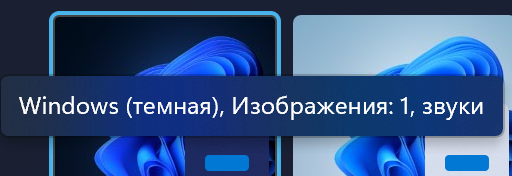
Judging by the comments on the forums, the appearance of Windows 11 did not leave most users indifferent and divided them into two camps: someone liked the design, and someone was not at all enthusiastic about it. But a Reddit user with the nickname Tech_Today2006 drew attention to a feature that, it seems, has not yet been made public – Windows 11 light and dark themes have different visual effects, and in light they are worse and not worked out.
Windows don’t light up
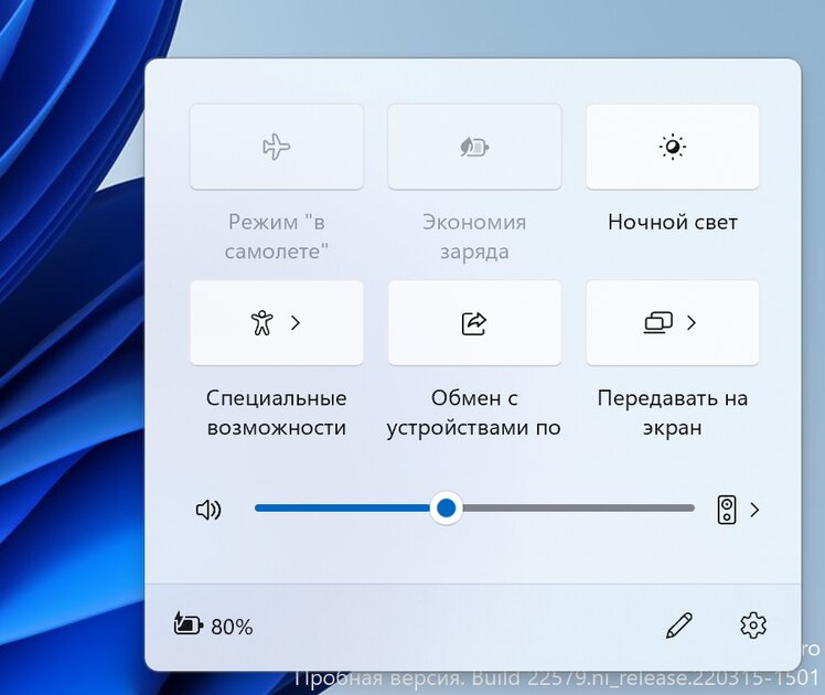
The main problem with the light theme is that it barely shows the acrylic effect that Fluent Design uses all over the place. It consists in the transparency of the upper window and the blurring of the area behind it, as if the user is looking through a cloudy, barely transparent glass. The shortcomings of the implementation of the acrylic effect in a light theme are most clearly visible on the “Start”, the area behind it is barely noticeable.
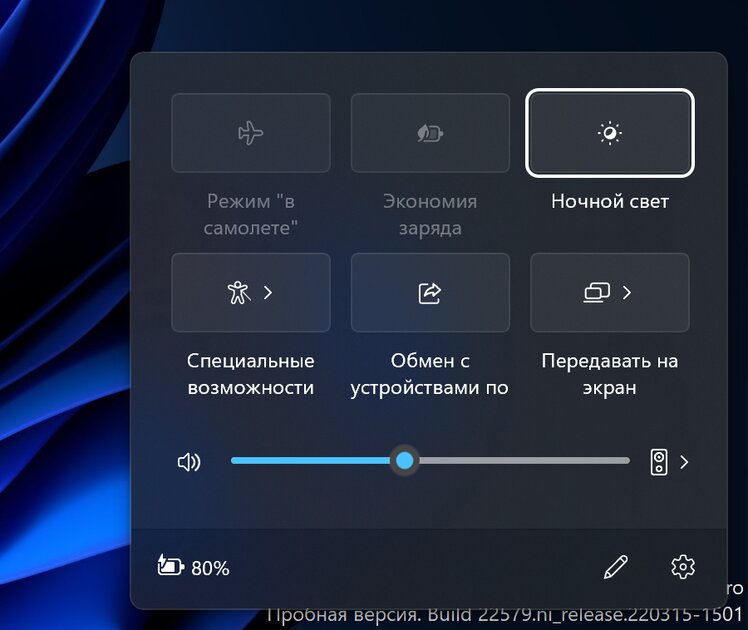
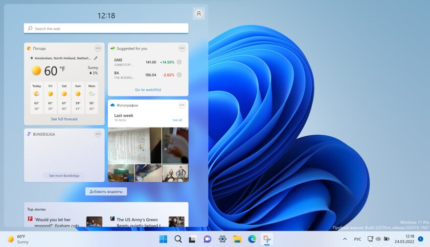
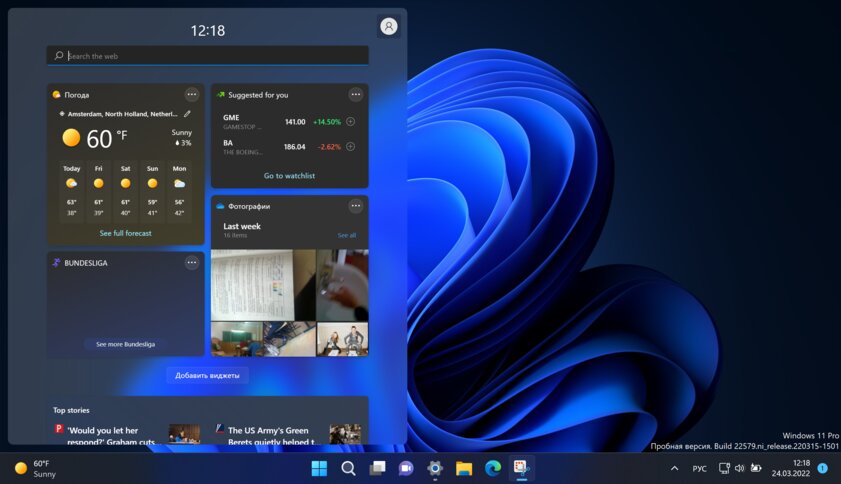
This light theme issue can also be seen in other elements of the system – for example, in the Quick Settings panel. In dark mode, the blue color is visible through the wallpaper, while in light mode it is impossible to notice.
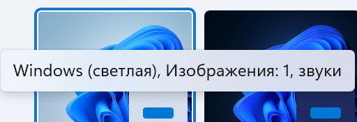
This can be seen even in very small elements of the system – where developers might not even bother (if they suddenly test each context menu). When changing the color mode, the explanatory label turns slightly blue if the dark theme is active, and does not change at all if the light theme is selected.
The indicator on the taskbar is almost invisible
Another negative feature of the Windows 11 light theme is that the indicator light on the taskbar, which displays the deployed active application, is almost invisible. In the close-up images below, the problem is not very visible, but in real use, when the taskbar occupies the minimum area below, the dark blue color of the miniature indicator looks very dull – you have to literally peer to distinguish the gray pointers from the “blue”.


In the dark theme, this, again, is not present – the bright blue contrasts strongly against the gray background.
It’s not a lack of light Fluent Design
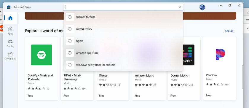
You might think that all this is a flaw in the Fluent Design style itself, on the basis of which the Windows interface is created. As if in the white theme you can’t make transparent windows so that they look normal. But it’s not, and Microsoft itself proves it!
The official Microsoft Store, of course, also uses the acrylic effect, and it works correctly even in the white theme – the elements behind appear through and blur.
Similarly with the widget panel, but in the case of it, the panel seems to be too transparent – in both light and dark themes. Perhaps this menu was some kind of exception, which Microsoft deliberately made more transparent.
All this only suggests that the developers have overlooked this problem, and it is quite possible and necessary to fix it.
Source: Trash Box
Donald-43Westbrook, a distinguished contributor at worldstockmarket, is celebrated for his exceptional prowess in article writing. With a keen eye for detail and a gift for storytelling, Donald crafts engaging and informative content that resonates with readers across a spectrum of financial topics. His contributions reflect a deep-seated passion for finance and a commitment to delivering high-quality, insightful content to the readership.


