
Shells from manufacturers often greatly change the appearance of Android itself. Xiaomi’s MIUI and Samsung’s One UI show this most clearly. The Xiaomiui portal compared the designs of MIUI 13 and One UI 4, comparing the key elements of the firmware, the material is intended to clearly show the differences, and not determine the best shell.
Animations
GIF animations available on click
Xiaomi uses fast animations – they may seem a little jerky, but the effects themselves are played instantly. This is typical for any smartphone, regardless of price or branding: both on the budget Redmi model and on the flagship Mi, animations work approximately the same.
In turn, in One UI, smoothness is a stumbling block, as many reviewers note interface lag even on premium models. In the case of devices of a lower price, this problem is exacerbated even more.
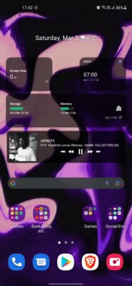
Main screen
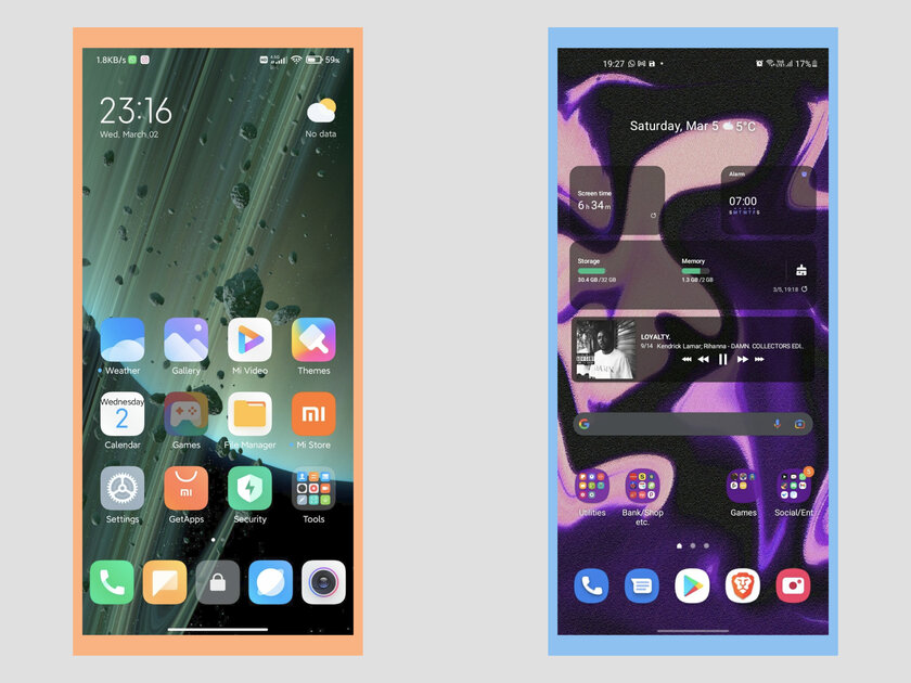
MIUI differs from most firmwares in that it does not have an application drawer by default – shortcuts to all installed games and programs are stored on the home screen. However, the familiar menu can still be activated in the settings in order to display only the necessary shortcuts on the desktop, and keep the rest hidden.
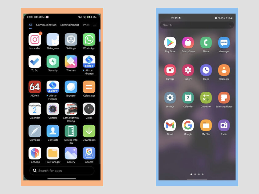
The launcher in One UI implies the use of an application drawer from the very beginning. The home screen itself can be customized in detail, but if you use the standard design, the desktop looks very discreet and not overloaded.
Menu of open applications
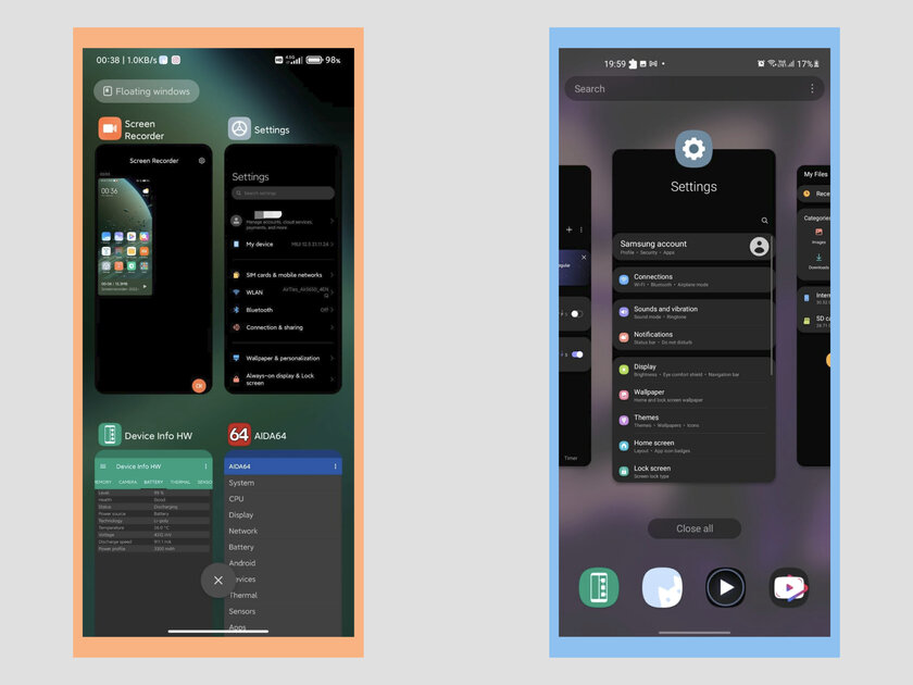
By default, MIUI uses a vertical bar to manage open applications, and this has become the hallmark of the firmware – applications scroll up and down, and swipe to the right or left. But here, as in many other corners of the system, Xiaomi allows you to choose a more familiar horizontal menu in the style of pure Android.
One UI provides only one view of the menu of open applications – horizontal. In terms of functionality, it is not inferior to others, you can close all processes with one button, pin the necessary games and programs, or perform a search.
Quick Settings
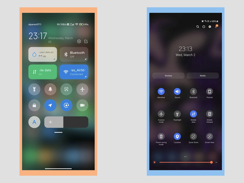
When designing this section, Xiaomi was clearly inspired by the implementation in iOS – this is clearly seen both in the design and in the division of quick settings and notifications into different curtains (called by a swipe from different corners of the screen). But if you wish, you can return the look familiar to pure Android, when notifications are displayed under the collapsed quick settings panel.
One UI uses the standard menu. He was not deprived of customization – you can change the location of the icons. This is extremely useful, because by default the quick settings menu is collapsed, and without additional actions, only the top row is displayed – it can be filled with the most frequently used elements.
Lock screen
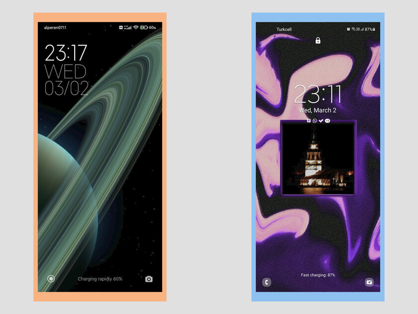
MIUI offers many design options that differ in the location of the clock and date widget. Otherwise, this is a familiar menu for Android with buttons for quickly launching favorite applications.
One UI also has a fairly standard lock screen, but stands out with a feature that allows it to display only the icons of the apps that sent the notification. This can help a lot if you don’t want to be constantly immersed in your smartphone.
Settings
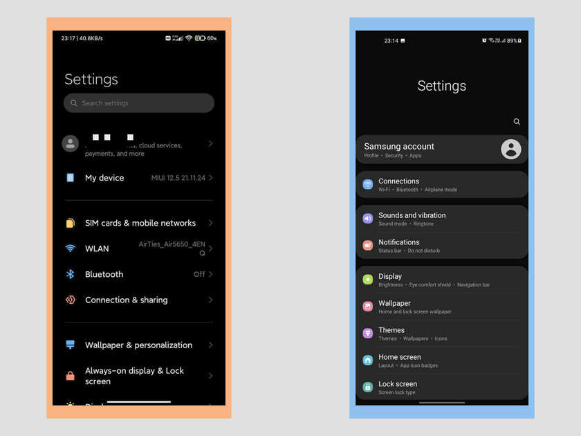
MIUI is a multifaceted firmware, many elements of which can be adjusted. Because of this, there are a lot of settings, and often they are far from obvious places. The main points are easy to find, but to find specific settings, you have to go a lot deeper. However, you can use the search – you just need to know the name of the item you are looking for.
Samsung’s firmware has always stood out as one of the most harmonious settings menus, and nothing has changed in One UI 4. However, now it is quite well designed in all shells, so it is impossible to single out any obvious differences.
Source: Trash Box
Donald-43Westbrook, a distinguished contributor at worldstockmarket, is celebrated for his exceptional prowess in article writing. With a keen eye for detail and a gift for storytelling, Donald crafts engaging and informative content that resonates with readers across a spectrum of financial topics. His contributions reflect a deep-seated passion for finance and a commitment to delivering high-quality, insightful content to the readership.


