
Google has dramatically changed the design priorities of its main OS when it introduced the Material You style to replace Material Design last year. Smartphones running Android 12 and 13 should offer a unique colorful interface in the form of a dynamic theme that allows apps, icons and widgets to adapt their colors based on the wallpaper you set.
While this is a necessary step in Google’s strategy to achieve a more consistent look and feel for Android, it doesn’t solve Material You’s biggest problem. The question is whether developers will want to support a visual concept that literally plays against uniqueness. It is unlikely, and there are no prerequisites that the situation will somehow change in the near future. Let’s take a closer look.
- To this topic: 5 very annoying things about Material You design. He’s far from perfect
Material You can serve as nothing more than Google style. The rest have their
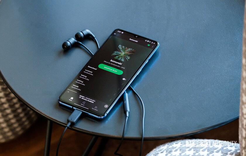
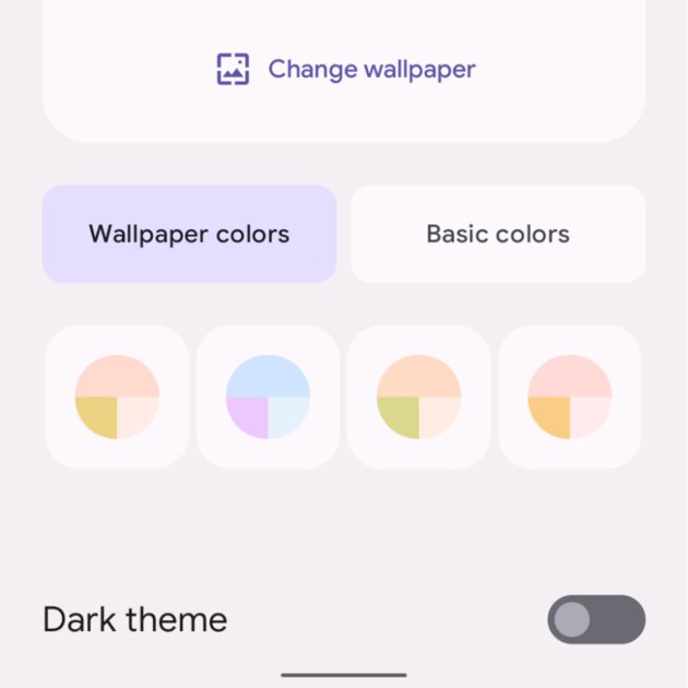
Material You is a major redesign as part of Android 12 and the biggest UI update to the operating system in Google’s history. All you have to do is choose a new wallpaper and all the accent colors will be instantly transformed in your smartphone – from quick settings toggles and desktop widgets to the keyboard and even Google’s own apps.
As a concept, Material You sounds great. The uniform design of the applications used and the Android elements themselves, everything looks monotonous and corresponds to the pattern of the wallpaper. Calm, stylish and beautiful. In a sense, the solution also keeps the smartphone fresh. All it takes to get a completely new color palette is a change of wallpaper. The process is simple, and you can change the picture at least every week.
However, Google is just wishful thinking about Material You. Everything easily turns to dust when it comes to the corporate design of other companies. Samsung, OnePlus, OPPO and Xiaomi have already adapted the skins to the Android 12 dynamic theme, but the process most likely will not go beyond the interface colors. Especially in the case of application developers who have been developing for a long time and are constantly being heard.
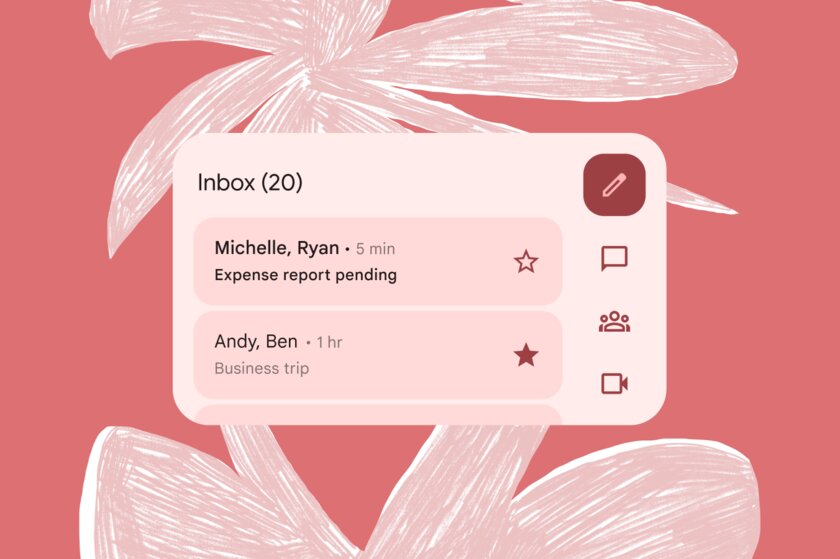
Facebook, familiar to everyone by its blue logo, will not make a green icon, widget, or app design just because Google wants it to. Just like Spotify won’t turn purple, Twitter won’t turn yellow, Amazon won’t want to be red, or Uber won’t turn brown. The reason is very simple: manufacturers, brands and developers spend millions of dollars on uniqueness, because it is important for participants in a huge market to be different from competitors in the first place. WhatsApp in the colors of Telegram or Netflix, similar to Kinopoisk, contradict the canons of corporate design, so brand managers will never abandon it.
Many have not been guided by official APIs for years and have not looked towards Android design guidelines. They design and polish a unique language that sits somewhere in between Google and Apple and looks universal on either platform. And every time Google implements a new feature or API, it takes forever for those services to get their vision of implementing them.
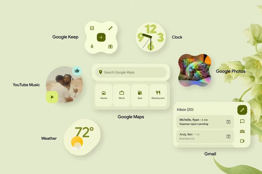
Thus, we have come to the obvious. Widely recognized third-party developers and popular brands with recognizable logos and color palettes won’t shoot themselves in the foot and choose to give up everything that makes them unique. It is likely that only a few of the smaller developers, authors of applications such as RSS readers, financial planners, file managers, photo galleries and others, will eventually adopt Material You. And they, on the contrary, will be very happy to feel at home next to the themed icons of Gmail, Chrome and YouTube.
Here, again, there is another minus of Material You. It lies in the incomplete implementation. Agree, Google can draw any number of options for elements, even dozens of shades, thematic icons and widgets. What about other applications? Yes, someone will agree to use Material You for the sake of following trends, but at the same time there will be many who will not support such a style. The struggle between the two sides will turn into a mess of colored icons and Material You widgets against the background of the usual non-thematic logos of VKontakte, Sberbank, Yandex.Music, 2GIS, Gosuslug, Ozon and so on. The list can be continued for a long time. Moreover, developers have no incentive to commit to Material You.
Material You is still far from user customization and manual modding
Users interested in creating a truly perfect desktop will resort to third-party launchers, icon packs, and widget makers. Customization fans know very well that the only way to get a truly custom interface is to manually customize it. Nobody forbids using free icons from enthusiasts, widgets can also be found or assembled in Kustom Widget Maker or similar applications.
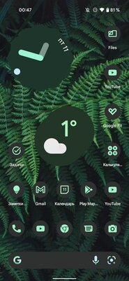
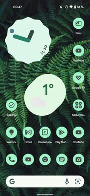
Material You is gradually (really very slowly) becoming more common. However, the interface still lags far behind manual customization. In Android 12, third-party apps can only use dynamic colors in the main interface and widget. In Android 13, they will also be able to create themed icons, and there is information on the web that Google will allow you to choose between four types of color palette, depending on the wallpaper you set. One way or another, more control is not foreseen. Developers, in turn, either implement Material You in some form or not.
Such nuances put Material You in a strange intermediate position. Hardcore fans of customizing interfaces will still have to create it themselves from scratch. And those who enjoy the diversity of app styles and widgets are likely to turn off some of Material You’s features. Who will end up using it and who will like it? It seems that those who will be satisfied with the general interface in the tone of the wallpaper, and Netflix or Uber icons in their own colors will not be annoying. Too narrow an audience category that Google cannot target. There are billions of active Android users.
Is a consistent interface that attractive?
The outcome of the material led me to what I have been thinking about since the announcement of Material You. Is the consistent interface that attractive?
At first glance, the answer seems obvious. In the 2010s, many of us spent almost every day tweaking our desktops, icons, widgets, and changing wallpapers so they all fit together perfectly. Over time, I realized that the settings that form certain similarities in the interface and make it attractive to the eye also make it difficult to use. It will take longer to find and open the app when the icon looks the same against the rest, and to distinguish between widgets in the middle of the wallpaper because they use the same color accents.
Monochrome tones might work well in a living room or on a website, but not for a series of tiny icons that perform different tasks. Design must be combined with usability, and when the situation comes to the absolute opposite, we face several logical questions. What’s more important? An illegible but visually harmonious desktop? Or one where there is contrast and difference that will allow you to quickly and easily find what you need? For me the answer is clear. I’d rather see unique icons (perhaps of the same shape for a bit of uniformity) than the same set with no visible differences.
The personalized interface is both a virtue and a key trap of Material You. The core concept puts design over usability, doesn’t meet the needs of the modding community, and most importantly, is useless for big brands in terms of uniqueness. How can Material You take off?
Source: Android Authority.
Source: Trash Box
Donald-43Westbrook, a distinguished contributor at worldstockmarket, is celebrated for his exceptional prowess in article writing. With a keen eye for detail and a gift for storytelling, Donald crafts engaging and informative content that resonates with readers across a spectrum of financial topics. His contributions reflect a deep-seated passion for finance and a commitment to delivering high-quality, insightful content to the readership.


