
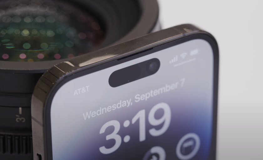
In place of the wide “bangs” in the new iPhone 14 Pro and 14 Pro Max, a more compact “pill” has come. How did the engineers manage to reduce the notch? And most importantly, why is this implementation better than the “bangs” on all previous “frameless” iPhones? Spoiler – it’s not just about physical size.
Everything in order in this article.
How the cut is arranged
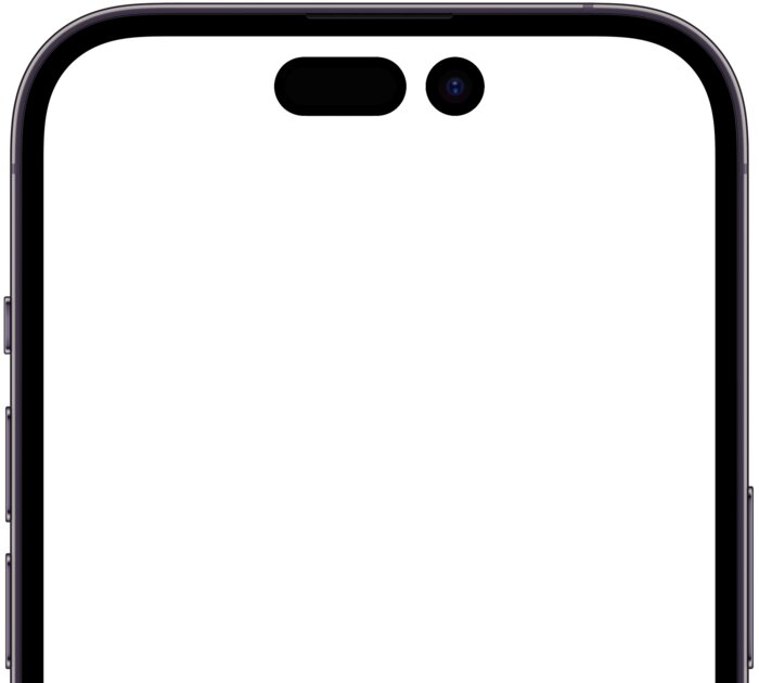
First you need to figure out what is inside the new “capsule”. In the iPhone 13, the notch was reduced by 20% due to the fact that the earpiece was moved to the very top of the front panel, and the infrared dot projector and infrared light emitter were combined into one module.
Now Apple has gone even further. According to the company, for the sake of an updated cutout for the display, they hid the proximity sensor. And the components of the Face ID system have been redesigned, so they take up 30% less space.
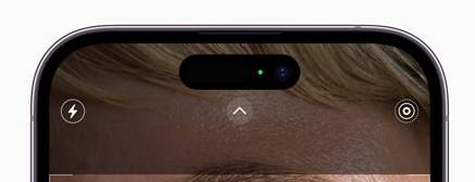
The design of the cutout of the iPhone 14 Pro hides another secret. On all promotional images and videos from the presentation, it is clearly seen that the “pill” is a single whole. Actually, it is not. The notch in the new iPhones is double.
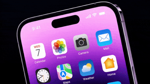
In one of the promotional teasers, a gesture works right from the bangs, which hints at the presence of a sensitive display right in the middle of the “capsule”. Further, you can see a virtual LED indicator of the switched on camera, also in the center of the cutout.
The veil of secrecy opens if you study the render from the official site. Opening it as an image, it turns out that the separation is hidden by animations.
And in real smartphones, this gap is hidden programmatically. After all, we remember that the iPhone 14 Pro has an OLED display. And as you know, such displays can display deep blacks.
However, this is not the only software solution with a notch in iOS.
How bangs were turned into an interface element
The notch and the area around it were even given a separate name – Dynamic Island (Dynamic Island). But why? It’s all about how the “pill” is played in the system. Believe me, there is something to see here.
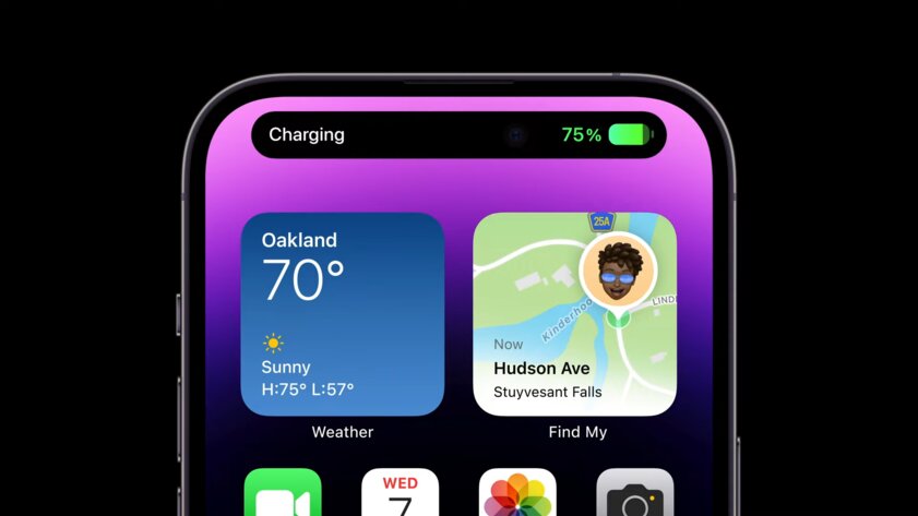
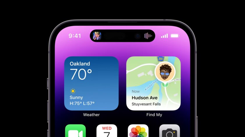
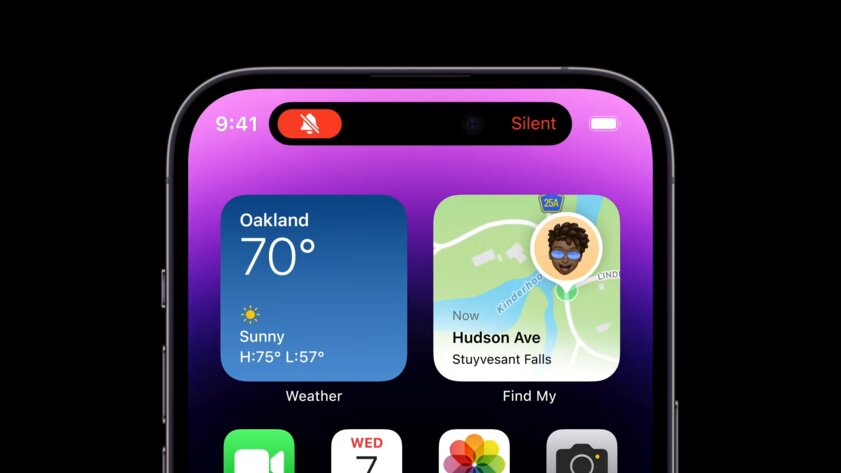
It’s worth starting with the fact that in different situations the area around the cutout plays a different role. When the program is minimized, Dynamic Island shows additional information. A quick press on the cutout returns you back, while a long press opens a mini-window with quick actions. For example, a compact music widget or a call window.
The same area displays notifications and incoming calls.
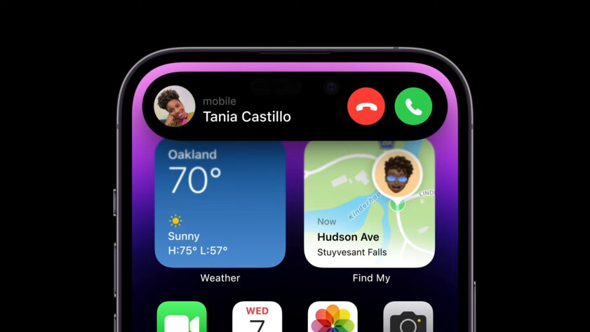
Let’s go back to the LEDs that I mentioned in the previous section. As it turned out, these are not physical components, but software indicators. Apple decided not to waste the empty space between the two cutouts and placed the symbols of the working microphone and camera there.
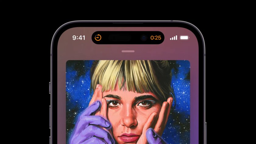
However, the cutout has the same drawback as the “bangs”. When watching a video in full screen, some of the content overlaps, and there is no way to fix this.
The most important feature of the “pill” is the ability to expand and display useful information.
Here are some examples of behavior implemented in iOS.
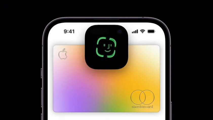
- When paying, the notch is covered by the Face ID window.
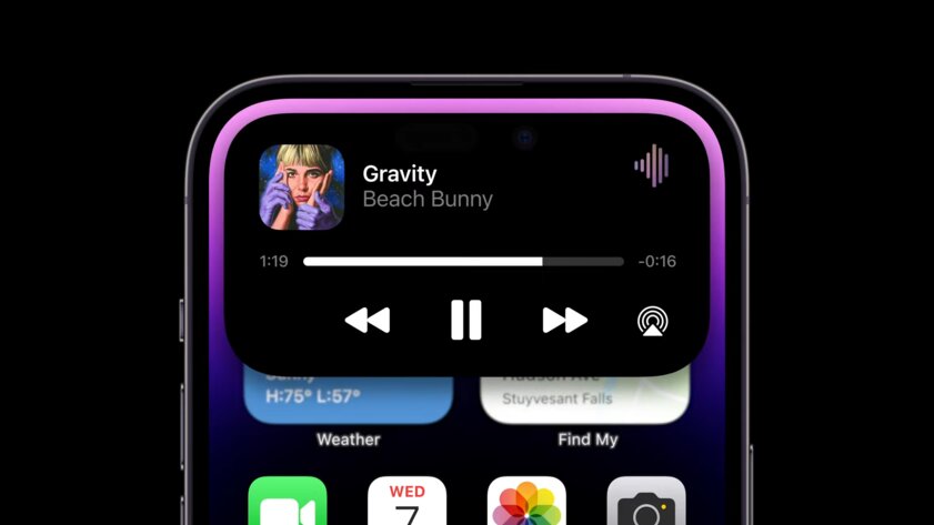
- During music playback, the cover art is displayed on the left and the playback animation is displayed on the right. A long press opens an interactive widget.
- In the timer, Display Island shows the app icon on the left and the time on the right.
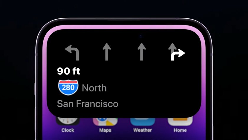
- In navigation mode, Display Island indicates the direction and distance to maneuver.
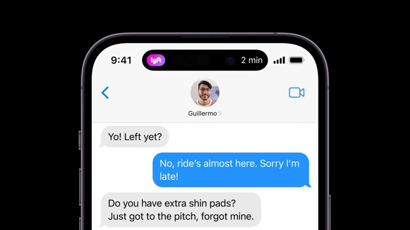
- There is even integration with third-party taxi apps – the company logo is shown to the left of the cutout, and the waiting time is to the left.
- Changing the sound mode with a physical switch on the edge is accompanied by an animation near the “capsule”.
- In Always On Display mode, there is a lock icon near the notch.
The idea is clearly “inspired” in the world of Android
This implementation of the cutout looks not just interesting. Apple was able to do something that no other Android smartphone, which has long been inhabited by compact cutouts, has been able to do. Namely, to correctly weave the “capsule” into the system, making it an important component of the entire interface.
It is possible that soon they will try to copy Dynamic Island to Android, as they did with the gesture strip and camera and microphone indicators. However, this will be much more difficult to do for two reasons. The first is that Android has a too informative status bar, which simply does not have enough space for an analogue of Dynamic Island. The second reason is the fragmentation of all shells and cutout shapes.
Source: Trash Box
Johanna Foster is an expert opinion writer with over 7 years of experience. She has a reputation for delivering insightful and thought-provoking articles on a variety of subjects. Her work can be found on some of the top online news websites, and she is currently lending her voice to the world stock market.


