
On January 15, Wikipedia turned 22 – in honor of this event, the encyclopedia received the first significant redesign in the last 10 years. In the new interface of the desktop version of the site (only she has received an updated appearance so far), the developers have focused on ease of use and ease of information exchange for a wide variety of people – even those who are not familiar with the Internet. One of the first to notice this was The Indian Express.
Wikimedia, which manages Wikipedia, has announced that it is redesigning it to meet the needs of a new generation of Internet users. To do this, the developers consulted with readers and editors of the encyclopedia. It is already known that the released redesign is only part of a series of improvements that are being worked on. It is reported that in the future the reading experience will be improved on mobile devices as well.
However, one new design was not enough – Wikipedia also received fresh / changed functions:
- a new way of searching that combines images and descriptions (this makes it easier to find articles in the database);
- language switching tools are now in a more prominent place – now you can access your preferred language almost instantly;
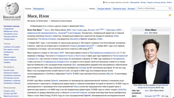
- title with search links, page title and sections now move with page scrolling;
- the table of contents has become clearer – by default it is on the side, and as you scroll through the sections, the corresponding chapter is highlighted in the table of contents (this makes it easier to navigate when reading).
At the moment, the new design is available only in English-language articles, that is, on 94% of the site (according to the developers).
Source: Trash Box
Charles Grill is a tech-savvy writer with over 3 years of experience in the field. He writes on a variety of technology-related topics and has a strong focus on the latest advancements in the industry. He is connected with several online news websites and is currently contributing to a technology-focused platform.


")

